
Advertising Campaign
illy Coffee
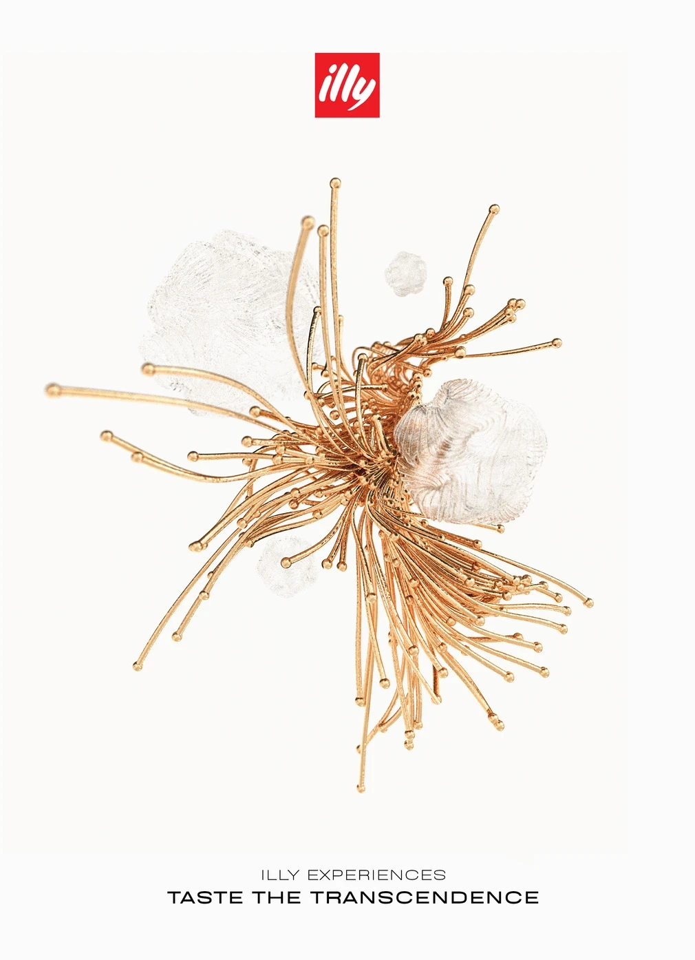
Celebrating Italian coffee through contemporary art. Surreal forms bring something unexpected to historic European streets with the idea of carrying a little of that imagination and beauty home in each cup.



Role
Art Direction
Year
2020
The project began with a brief to develop an advertising campaign for illy aimed at people aged 20–40. It called for a poster series, an experimental catalogue, and a short digital teaser. The starting point for the posters was the experience of drinking the coffee: its taste, the pleasure of taking a break, and the feeling that comes with it.
There was a useful connection in Italian coffee culture. Having an espresso at the counter is a familiar pause in the day, it can be brief and still feel important. That gave the project a scale to work with: a small everyday moment that could become something much bigger in an image. Italian coffee ritual
illy also has an established relationship with art; its Art Collection began in 1992, inviting artists to work on the surface of an espresso cup; bringing divine beauty into something people use every day felt close to the idea behind this campaign.
The challenge was showing an experience that someone looking at a poster couldn’t taste. I wanted to give that experience a form, something that suggested flavor and imagination, while leaving room for people to make their own connection. The shapes sit somewhere between flowers and liquid; flowers made sense because of the way they open outward, their repeated parts also gave the compositions movement. In the lighter images, thin, glasslike strands spread into the surrounding space suggesting something fleeting, like an aroma or a thought beginning to form. The darker compositions get together more tightly around the espresso; layers of petals spiral outward from the coffee, making it the center of the image. The contrast gives the series different moods, from something airy and delicate to something more concentrated.
The outdoor setting was part of the idea. Against the stone façades and rows of windows, the flowing shapes were meant to feel a little out of place, something strange appearing on a building you might otherwise walk past. The layouts stay consistent across those variations. The red illy logo makes the brand easy to recognize while the small copy leaves most of the poster to the image. In the outdoor mockups, that simple arrangement gives the intricate forms space to be seen.
Taste Transcendence gives a name to the idea: enjoying a familiar cup of coffee and becoming a little more open to the beauty around you.

illy is a 100-year-old Italian coffee brand with a very settled visual language: red square, white script, warm Italian light. The brief was to say something new about the taste without saying anything new about the logo.




illy Experiences imagines the coffee as an altered state. Each roast is rendered as a sculptural form that shouldn’t exist—a bloom of gold and white for the light roast, a spiral of iridescent dark for the espresso—set against black and placed into the streets of old European cities. Futuristic objects on historic stone contrast in the image which in of itself has tension in the cup. Two lines carry the campaign—Join the Dark Side for the dark roast, Taste Something Higher for the light. Executions run from full building wraps to street posters and bus shelters. The red square never moves, but everything around it does.
Art Direction
Advertising Campaign
Out-of-Home
2021
Brand Identity · Motion Design · Out-of-Home
Visual Identity for
Cyprus Design Week 2026 Festival
Cyprus Design Week is a multidisciplinary festival bringing together graphic design, motion, digital media, architecture, fashion, product design and other creative practices. I developed a visual identity that transforms the familiar instruction to “think outside the box” into something more physical,
Arts & Culture
Visual Identity for
Cyprus Design Week 2026 Festival
Cyprus Design Week brings together people from across the creative disciplines. I created a concept identity around the idea of breaking free from your own limitations, using expressive typography, vivid color and motion to give “think outside the box” a fresh perspective.
Project Type
Festival Branding
Role
Creative Direction & Design
Year
2026
Brief
The brief was to create a logo and visual identity for a festival celebrating everything from graphic and motion design to fashion, interiors and product design. It needed to bring these different disciplines together and connect with both designers and the wider public. I wanted it to capture the excitement of discovering something new and the freedom to explore ideas beyond what you already know.
Concept
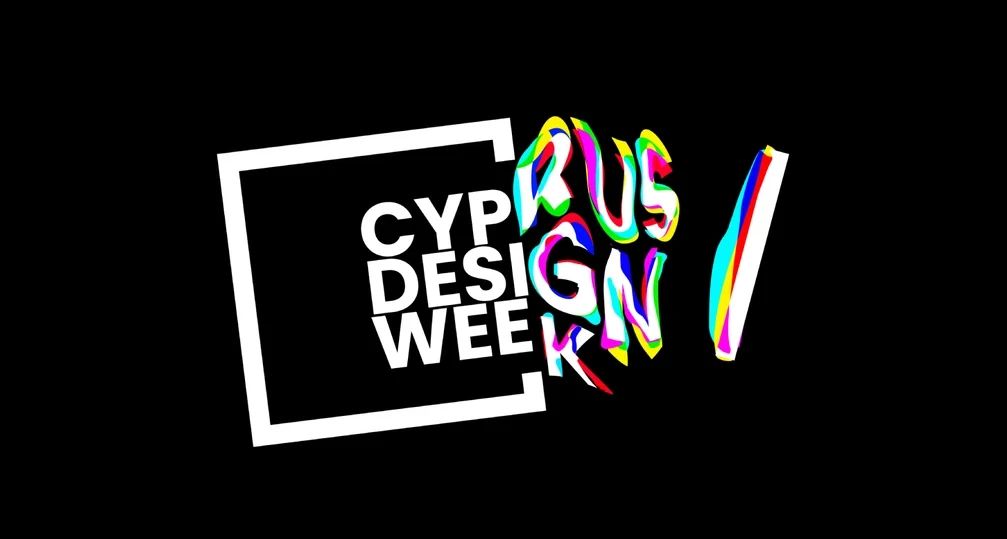
I started with the cliche phrase “think outside the box” and made it physical. A black frame becomes the boundary with letters stretching and spilling beyond its edges. The contrast between the structured typography inside and the expressive forms outside captures that feeling of breaking free and seeing what else is possible.
Visual Language
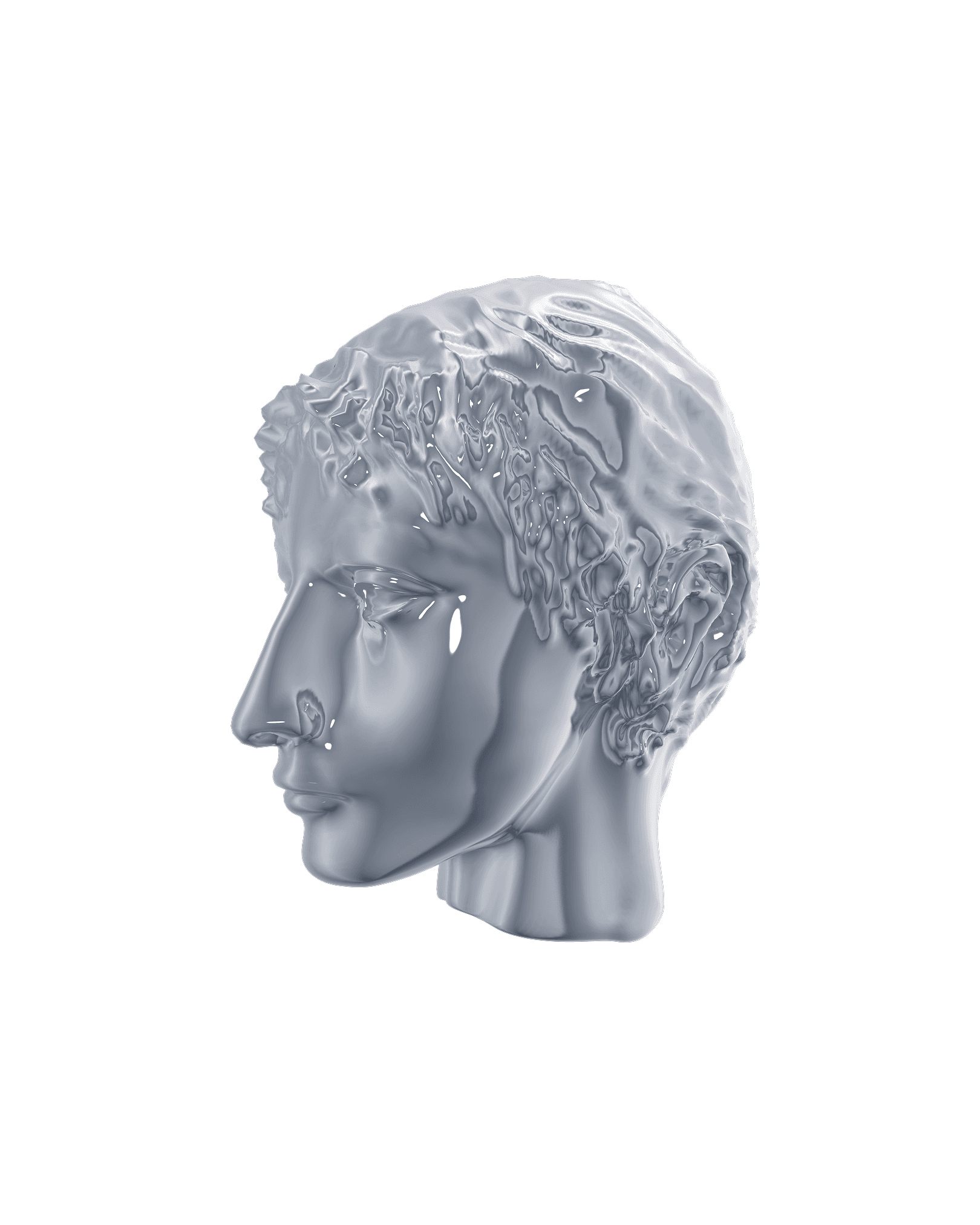
A Cypriot limestone head connects the identity to the island’s history. I transformed it with vivid color and distortion, bringing an ancient form into a contemporary setting. The full spectrum of color reflects the mix of disciplines, people and perspectives at the festival.
Brand Identity
2024–2026
YSecurity
4.6x organic traffic. 5.9x engagement time. 2.5x revenue. +70% podcast downloads. Built from zero as the company's first non-engineering hire — brand identity, design system, website, content, and the entire marketing function.
Project Type
Festival Branding
Role
Creative Direction & Design
Year
2026